In the competition within the food and beverage industry, one of the most fundamental and crucial elements is packaging design. This involves the selection of colors as a primary component. Colors not only provide visual identity to a product but also exert a significant psychological impact on consumer perception. Therefore, the role of color in the marketing and branding of food packaging is something that cannot be ignored.
Color has the ability to trigger emotions and influence consumer behavior. Each color has specific meanings and associations, so the choice of color in food packaging should consider the product’s characteristics and marketing goals. For example, the color red can express energy and courage, while green is often associated with freshness and health.
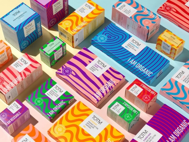
Color plays a key role in building brand identity and distinguishing products from competitors. Consistency in color throughout a product line creates strong brand recognition and helps consumers easily identify the brand on store shelves. For example, a bright yellow color associated with a specific brand can create positive associations and enhance consumer recall.
Here are some symbolic meanings of colors and their implementation in branding and marketing a brand/product:
- Red:
- Symbol of energy, enthusiasm, and courage.
- Used to attract attention and prompt consumer action.
- Suitable for food products with strong and bold characteristics, such as spicy sauces or energy drinks.
- Blue:
- Associated with calmness, trust, and coolness.
- Suitable for food products that want to emphasize cleanliness, freshness, or premium quality, such as seafood or isotonic drinks.
- Green:
- Represents freshness, health, and sustainability.
- Often used for organic products, salads, or foods that emphasize high nutritional value and eco-friendly or recyclable products.
- Yellow:
- Symbol of cheerfulness, happiness, and warmth.
- Suitable for food products that want to attract attention and create a positive impression, such as snacks or breakfast products.
- Orange:
- Symbol of energy, joy, and positive spirit.
- Symbol of creativity and gives a sense of surprise. Products with orange packaging may want to highlight the uniqueness or novelty of the product.
- Health and Diversity: The orange color is associated with certain fruits and vegetables rich in nutrients, such as oranges, carrots, and pumpkins. In food packaging, this color may be used to emphasize health and nutritional diversity.
There are many more packaging colors that represent psychological functions and purposes.

In the context of food packaging marketing, the role of color is not merely about visual aesthetics but also embraces consumer psychology and brand marketing strategies. By understanding the emotional and psychological impact of colors, food companies can enhance the appeal of their products, build a strong brand identity, and create an unforgettable shopping experience for consumers. Therefore, careful color selection in food packaging is not just a design task but a strategic investment in the success of product marketing.
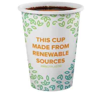
One of Asia Pulp and Paper’s products, Foopak Bio Natura, also applies this concept by aligning color branding with its goals. Foopak Bio Natura is strongly associated with green and orange. Green signify that Foopak Bio Natura products are environmentally friendly, such as recyclable, compostable, and plastic-free. Meanwhile, orange indicates that Foopak Bio Natura is packaging for food and beverages.
Therefore, in the competitive food industry, wise color selection in packaging not only creates attractive products but also captures consumers’ hearts with a profound impression. By weaving harmony between color psychology, brand identity, and visual appeal, smart food packaging not only creates successful market products but also provides an unforgettable shopping experience.